My Role and Responsibilities
- Lead Physical-Digital Experience Designer designer across Star Wars Force Band hardware UX and BB-8 companion app
- Field research program: 600+ participants across children and adults in 6 months
- Human factors design across haptic, audio, and light feedback systems
- End-to-end experience design from unboxing through returning play
About This Project
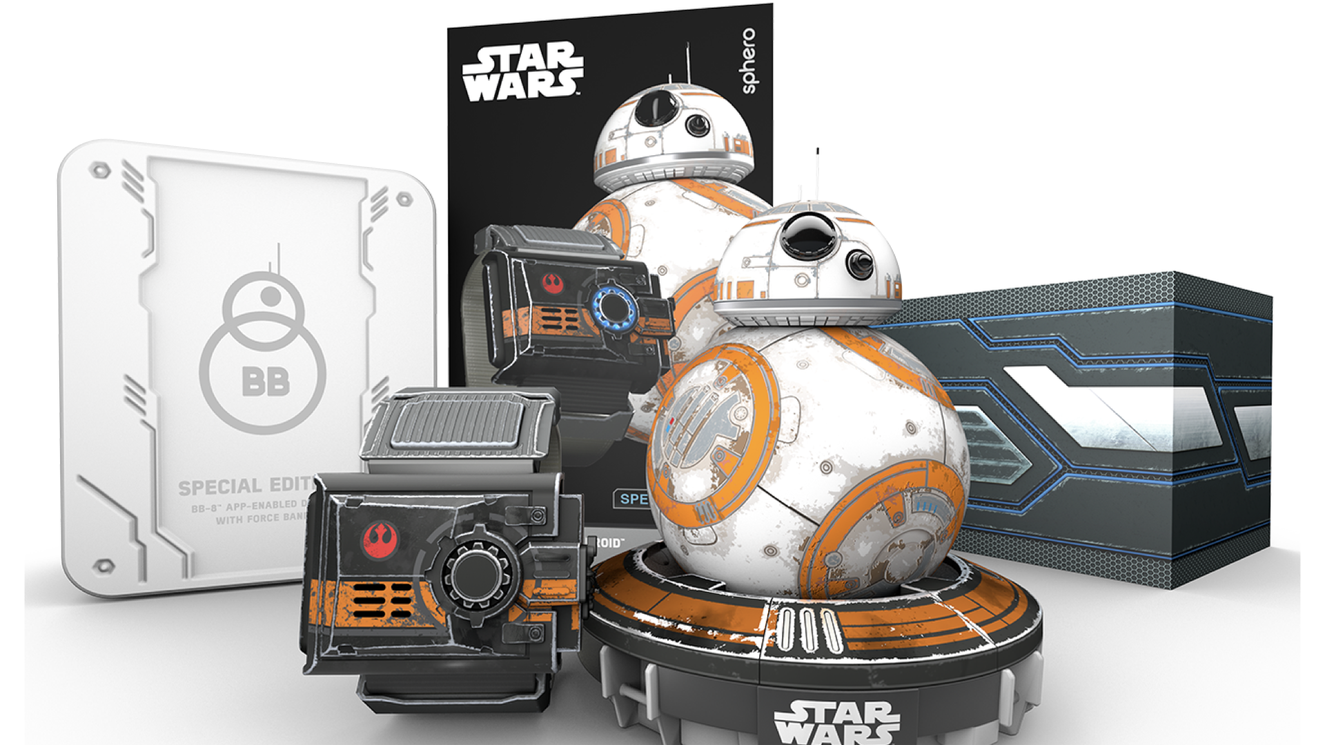
The Force Band had no screen. Players controlled BB-8 through wrist gestures, with haptic pulses, audio tones, and LED patterns as the only signals of system state. There was no existing interaction model to extend. I had to define a physical grammar for a product where the wearable itself was the primary interface.
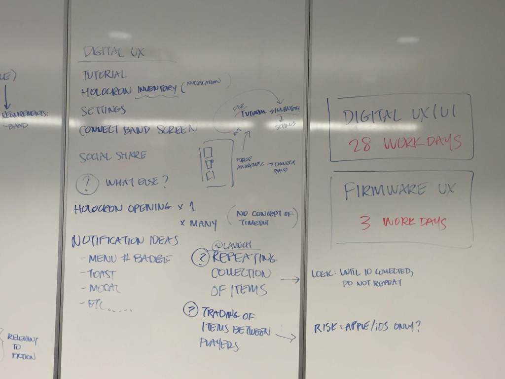
This required coordinating experience design across hardware, firmware, software, and packaging simultaneously as the sole designer on the project, with a small team helping execute.
The Core Design Challenge
All of the product’s critical friction points shared the same root: players had no legible model of system state. In a traditional app you can see what mode you’re in. When the interface is majority haptic and audio, communicating state means building a consistent physical language while pairing it with digital designs.
The four problems I was accountable for solving:
- Players couldn’t build a mental model of where they were in the Force Band’s screen-less menu system
- Players didn’t know which play mode they were in (active vs. passive), or why the robot was behaving unintentionally
- Players couldn’t reliably calibrate the direction of their robot to their wearable
Design Process
- Weekly usability research cycles: run the tests on Monday, findings on Tuesday, design updates by Friday
- Haptic comprehension testing: could players correctly interpret pulse patterns?
- Gesture ergonomics: was the band worn and used correctly after a tutorial?
- Mode navigation testing: could players move between drive, Force Awareness, and passive modes deliberately?
- Physical-digital onboarding design: schema-first model building before product interaction
- Dev-ready specifications across firmware, hardware, and mobile app
- Post-launch iteration informed by app store feedback and continued research
Key Design Decisions
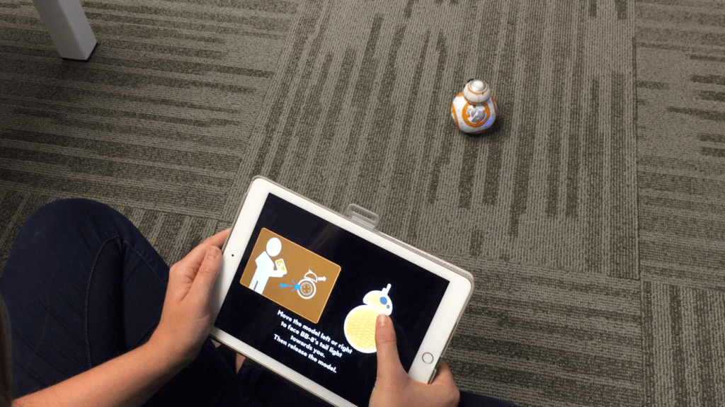
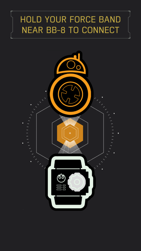
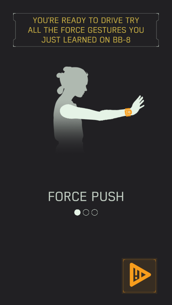
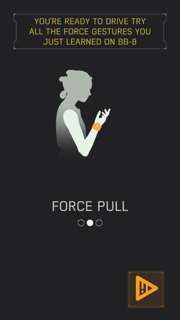
Mirror physical space, not just digital state
Early robot drive screen designs showed animated models that could be swiped/pulled to map digital movement to robot movement themselves. Redesigning the digital interface to include animated human forms helped players better understand how to connect and calibrate their robot.
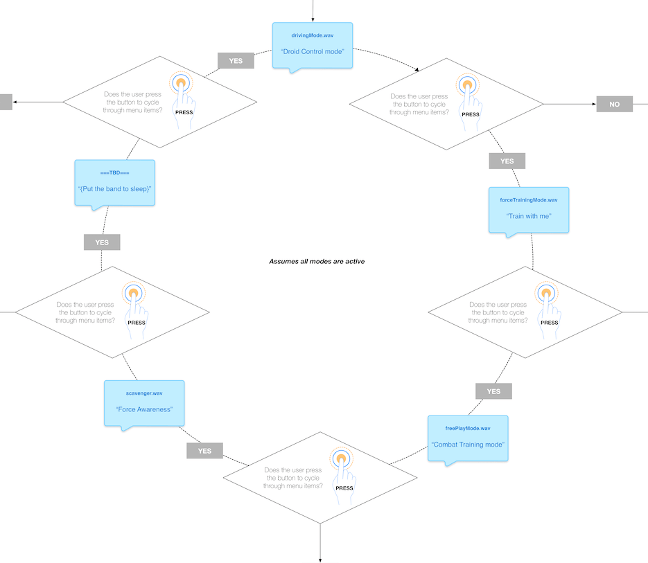
Leverage a closed loop system
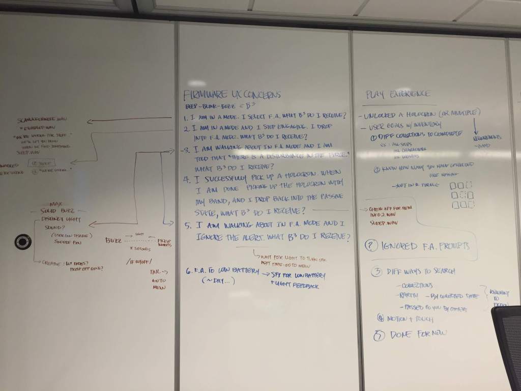
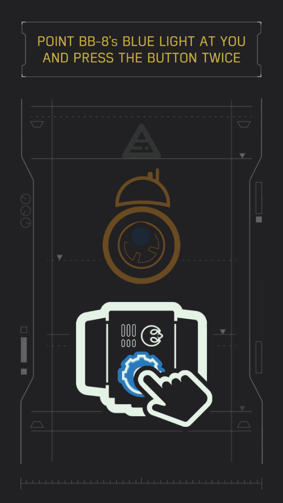
The Force Band had no display, so mode navigation had to work entirely through audio announcements and button presses. This flow map shows the circular menu architecture I designed for the band’s firmware: a single button cycles the user through four modes (Droid Control, Train with Me, Combat Training, and Force Awareness) with each mode announced by a corresponding audio file the moment it’s selected.
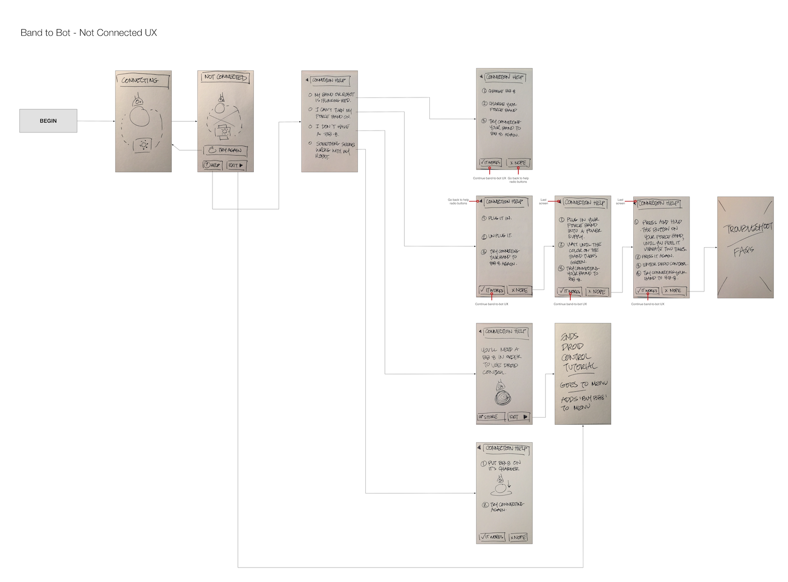
Design the failure states
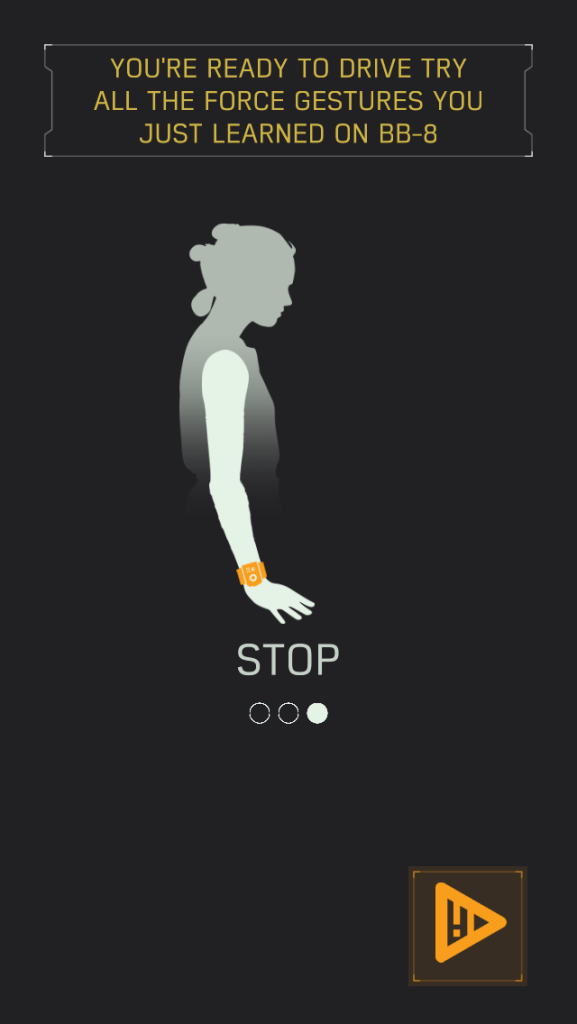
The Bluetooth disconnection flow initially used generic error language. The redesigned flow demonstrated gestures through visual and motion design rather than describing it in text.

Outcomes
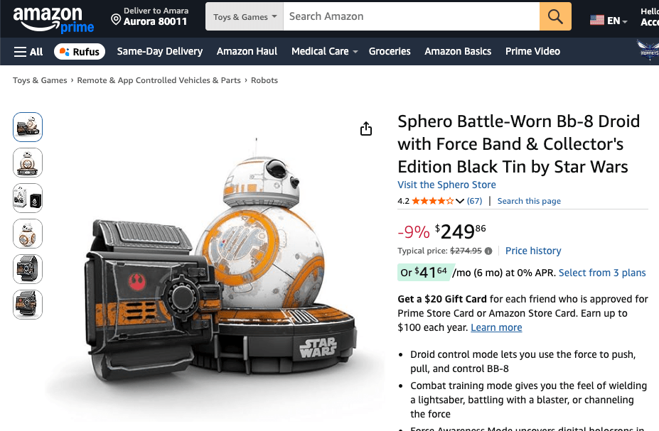
- App Store: 4.6/5
- Google Play: 4.3/5
- Amazon: 4.2/5
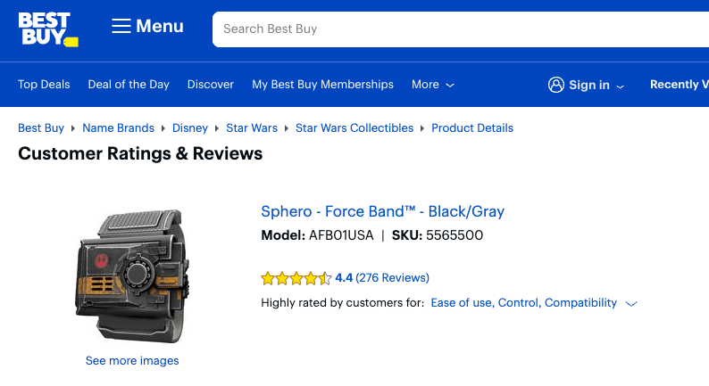
- Best Buy: 4.4/5
- Research program findings cross-pollinated into Sphero’s SPRK Lightning Lab improvements